THE POWER OF COLOR PSYCHOLOGY IN BRANDING
UNDERSTANDING COLOR PSYCHOLOGY
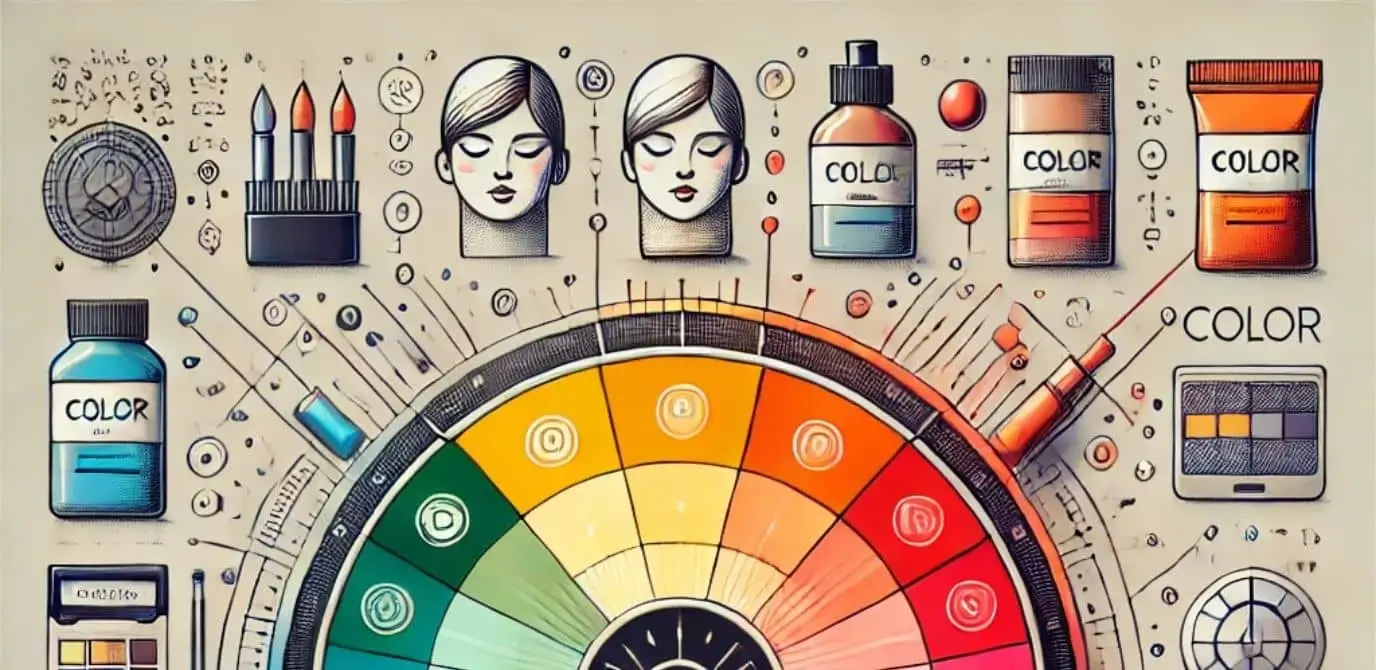
Colors evoke emotions and can significantly influence how we perceive a brand. By understanding color psychology, design agencies can create more compelling and effective brand identities. The psychological impact of color is profound, affecting mood, perception, and behavior. For instance, blue is often associated with trust and professionalism, making it a popular choice for corporate brands. Red, on the other hand, evokes excitement and urgency, often used in marketing to stimulate quick decisions.
Different colors can evoke different feelings: blue is often associated with trust and professionalism, red with excitement and urgency, and green with growth and health. Selecting the right color palette is crucial for aligning a brand’s message with its visual representation. By strategically using colors, brands can communicate their values, attract their target audience, and differentiate themselves from competitors.
APPLYING COLOR PSYCHOLOGY
When creating a brand identity, consider the emotions you want to evoke. Choose colors that align with these emotions and your brand's values. This strategic use of color can enhance brand recognition and customer loyalty. For example, a wellness brand might use greens and blues to convey tranquility and health, while a luxury brand might opt for black and gold to suggest elegance and exclusivity.
It’s also important to consider cultural perceptions of color, as meanings can vary significantly across different cultures. Conducting thorough market research can help ensure that your color choices resonate positively with your target audience.
Integrating color psychology into your branding strategy can create a more cohesive and impactful brand experience. By understanding and utilizing the power of color, you can create visual identities that not only attract attention but also foster emotional connections with your audience.